iTAB — redesigning the product card
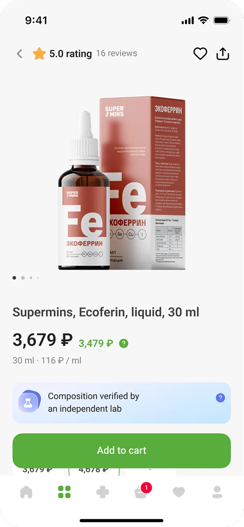
iTAB is a health and wellness store on the Russian market; every screen in this case is the live product with real items. I redesigned the product card for web and mobile so that a product’s value, the reasons to trust it and the way to buy it are clear at a glance.
- Funnel
- Drop-off down · NDA
- Purchase
- Add-to-cart up · NDA
- Rollout
- Adopted across the catalog

Problem
Supplements are a category where trust decides the purchase, and the product card was the weak link: people left instead of buying. They had to decide with too little to go on — benefits, composition, lab confirmation, reviews and availability were scattered across the page, with nothing showing what mattered most.
Task
Redesign the product card for web and mobile to reduce drop-off in the supplements category: make the product easier to evaluate, put the trust signals where the decision is made, and keep people in the store when the item they came for is out of stock.
Users
People choose health products carefully. Before buying, they want to know what the product is, whether the composition can be trusted, how it compares with alternatives — and what to do if it is out of stock.
What changed
I rebuilt the card around the order in which people decide: understand the product, trust it, compare, buy — and know what to do when buying isn’t possible.
Audit and competitors
I started from two directions: an audit of the existing card against the questions people ask before they buy, and a review of competitor cards from neighboring categories. Both pointed to the same gaps.
Purchase feedback
After tapping Add to cart, it was unclear anything had happened
Trust signals
Reviews, lab results and research sat apart instead of building one case
Unavailable state
An out-of-stock product was a dead end
Signal overload
Badges, labels and markers competed for attention with no system behind them
1. Clear purchase states, with a next step
I defined the purchase states for products in stock and out of stock. In stock: after a tap, the button turns into a quantity control, so the response is immediate. Out of stock: the card offers a restock notification and alternatives instead of ending the visit.


2. Building trust through reviews and evidence
I separated the layers of trust inside the card: research cards add context about the product, while reviews with an AI summary show what customers keep repeating, so the purchase area stays uncluttered.
Evidence stays a supporting layer — the card builds trust without turning into a medical article.


3. Putting the supporting signals in order
Badges, lab confirmation, category markers and promo labels went into one visual system. Trust markers got an interactive layer: the details open on demand instead of taking up permanent space on the card.


Result
After launch the funnel moved in the right direction on every step we redesigned.
Unavailable is no longer a dead end: part of the visits continued through restock or alternatives instead of leaving; the share is under NDA.
One card system: trust, availability and purchase states work the same way in every category.