Hooh — an AI assistant for documents
Hooh helps people make sense of complex documents: it shows the gist, opens the details on request and answers questions with links to the source.
- Launch
- Shipped on web and iOS
- Core pattern
- Reading in layers


Problem
Contracts, reports, insurance papers and legal texts make people anxious. The problem is not only the volume but the uncertainty: where to start, what matters most, whether a risk, a deadline or a critical clause is hiding somewhere. People need a calmer way to grasp what a document is about before deciding whether to go deeper.
Task
Design an MVP for web and iOS that helps people understand complex documents faster — with less stress and less reading.
Users
People without a legal background who regularly deal with complex paperwork: expats, digital nomads, anyone with a lease or a visa form. They use Hooh to decode lease agreements, visa requirements, insurance papers and banking contracts — and see what matters without reading every page.
What we launched
We designed and launched the MVP on web and iOS and defined its core experience: upload a document, read it in layers, ask questions in chat, keep files organized.
Design process
I started with the competitors. Genei, Notion AI and Microsoft Copilot for documents all give the full summary up front, which takes the choice away: you can’t decide how deep to go.
We reviewed early versions with colleagues, developers and investors. Each of them uploaded a document they wanted to understand. After the summary we asked whether the document had become clearer and how useful the explanation was.
Reading in layers
A summary on its own hides the details; a full breakdown on its own overwhelms. So reading is split into three layers: a snapshot, a detailed summary, and the assistant’s answer to a specific question.
1. Snapshot
A verdict at a glance — the gist before you commit any attention
2. Summary
A structured breakdown — go deeper when something looks important
3. Q&A
A chat about this document — ask a pointed question when a specific worry comes up
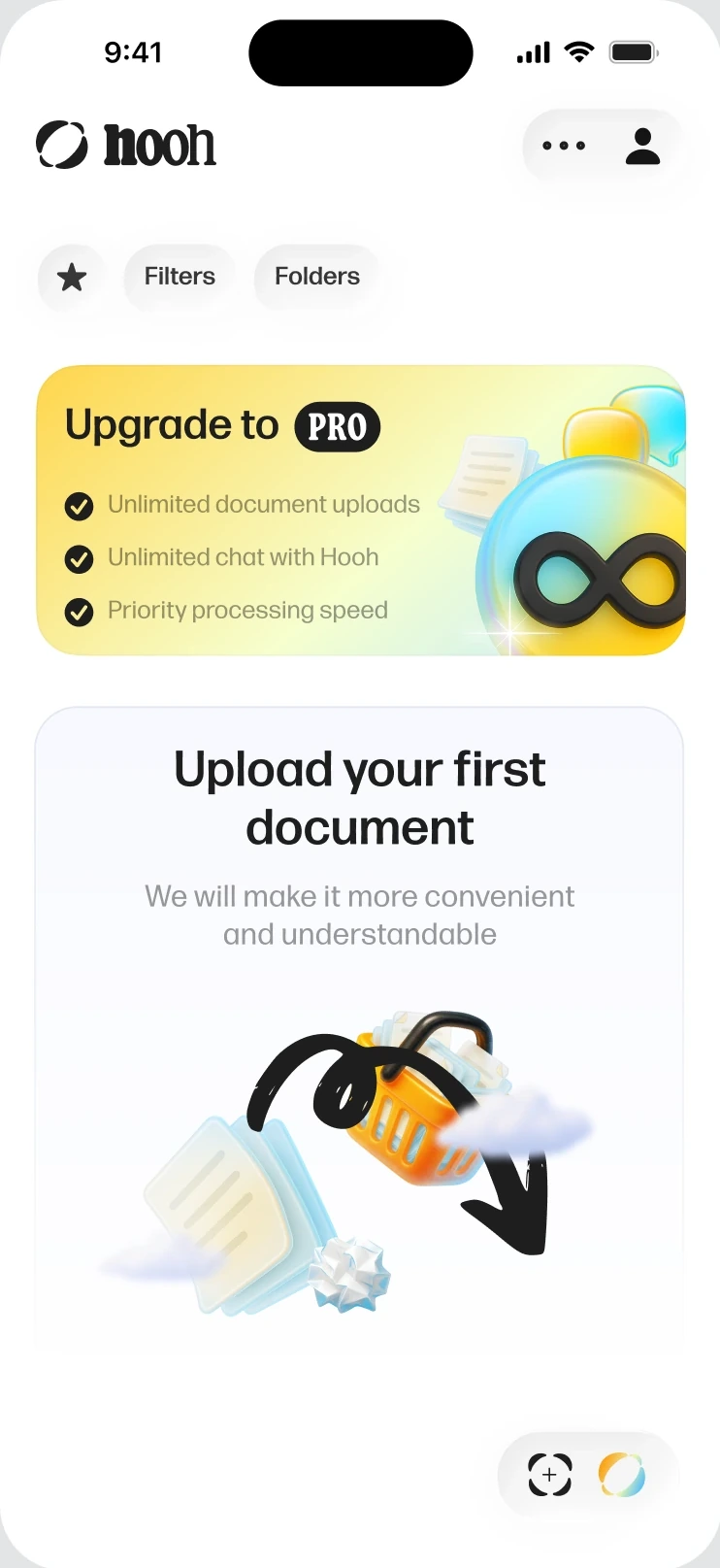



When to show the result
In an early version, the snapshot of an uploaded document opened full screen as soon as processing finished. It got in the way: by then the user could already be in a chat or working on another document.
Now a compact modal shows the result instead, and it opens on its own only on the home screen, where the upload started.
A conversation as a way into a document
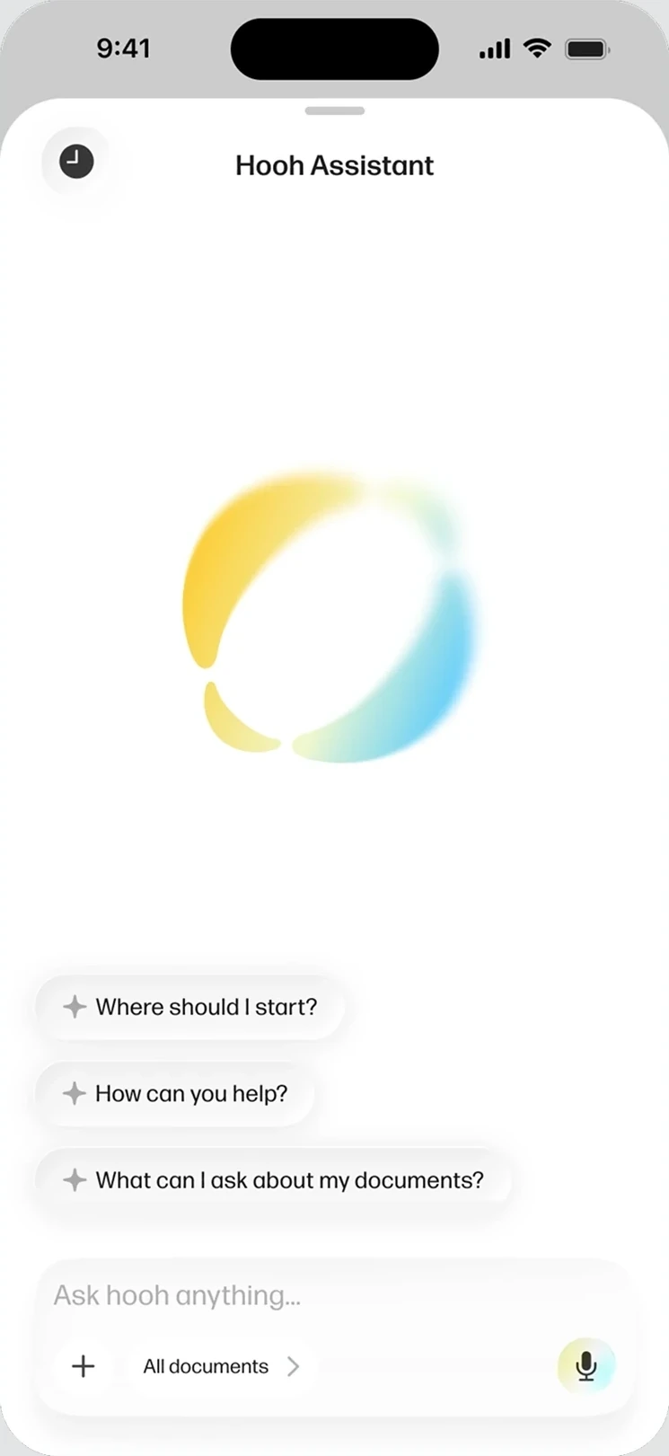
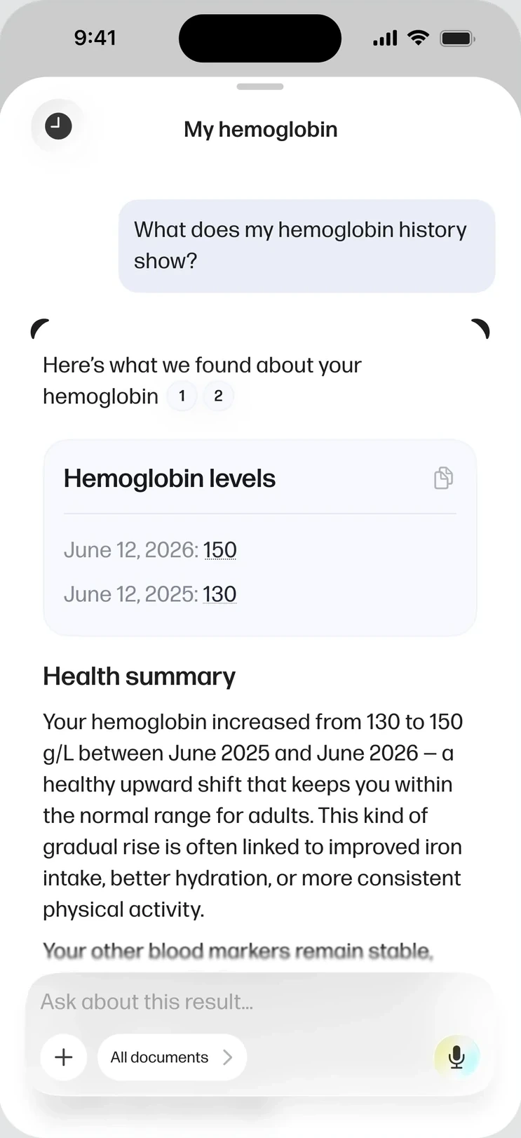
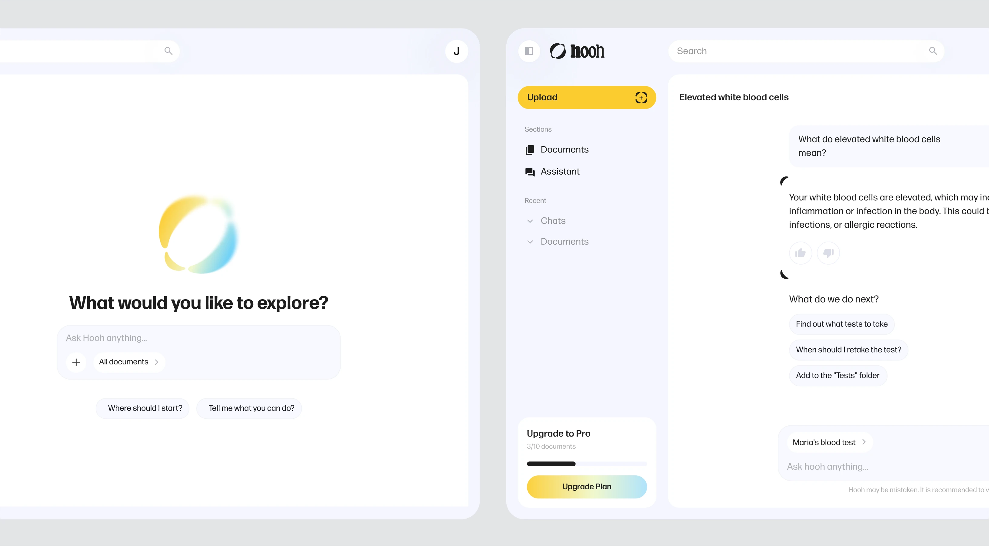
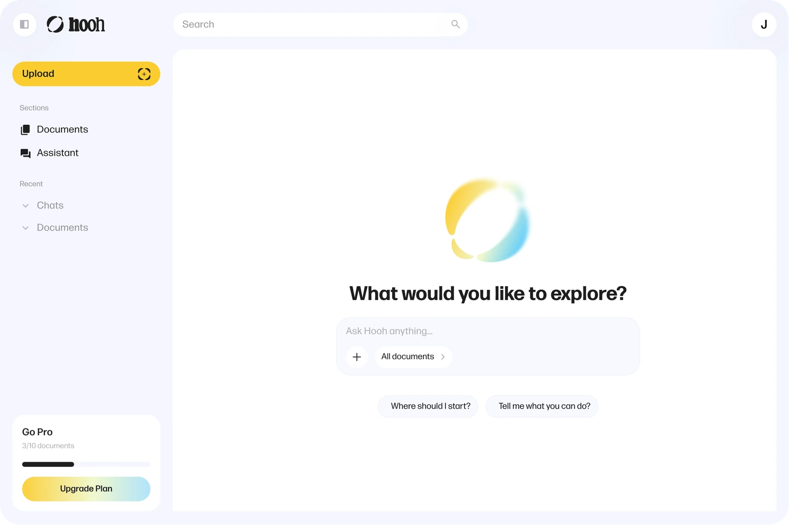
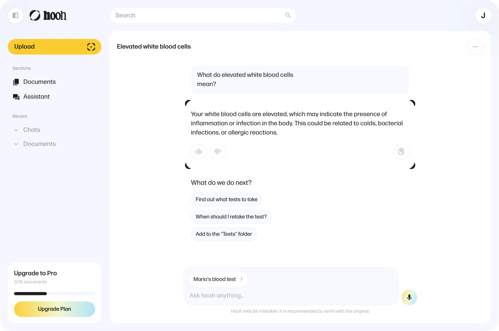
The assistant keeps the uploaded documents as its context: people ask follow-up questions, move across categories and pull out what they need without scanning long text themselves.


Trust by design: the assistant can be wrong
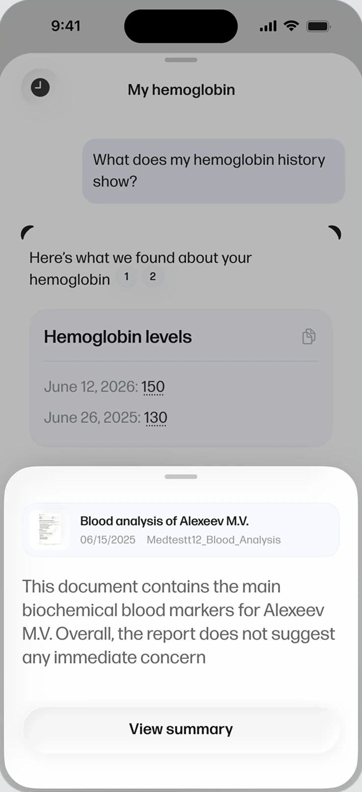
An assistant that reads your contracts and lab results only earns trust if it can show its work. Three guardrails run through the whole experience: every claim links back to the exact source document, users see and control which documents the assistant reasons over, and the interface says plainly that Hooh may be wrong — keeping the original file one tap away.
Sources on every claim
Citation chips in answers open the exact document behind each number
Scoped context
The All-documents selector shows — and limits — what the assistant reads
Honest uncertainty
A permanent “Hooh may be wrong” notice points users back to the original
Outcome
Launch: the MVP shipped on web and iOS as the first release of Hooh.
The pattern that stuck: reading in layers became the core pattern of every later document feature, including the document workspace.